A. РЕКЛАМНИЙ РОЛИК
B. РЕКЛАМА В ПРЕСІ
C. ЗОВНІШНЯ РЕКЛАМА
D. РАДІО РЕКЛАМА
E. ВІДЕОМАЙСТЕРНІСТЬ
F. ДИЗАЙН
G. ІНТЕРАКТИВНА РЕКЛАМА
H. КРЕАТИВ В МЕДІА ПРОЕКТАХ
I. PR-ПРОЕКТИ
J. ПРОЕКТИ МАРКЕТИНГОВИХ СЕРВІСІВ
K. РЕКЛАМНІ КОМПАНІЇ
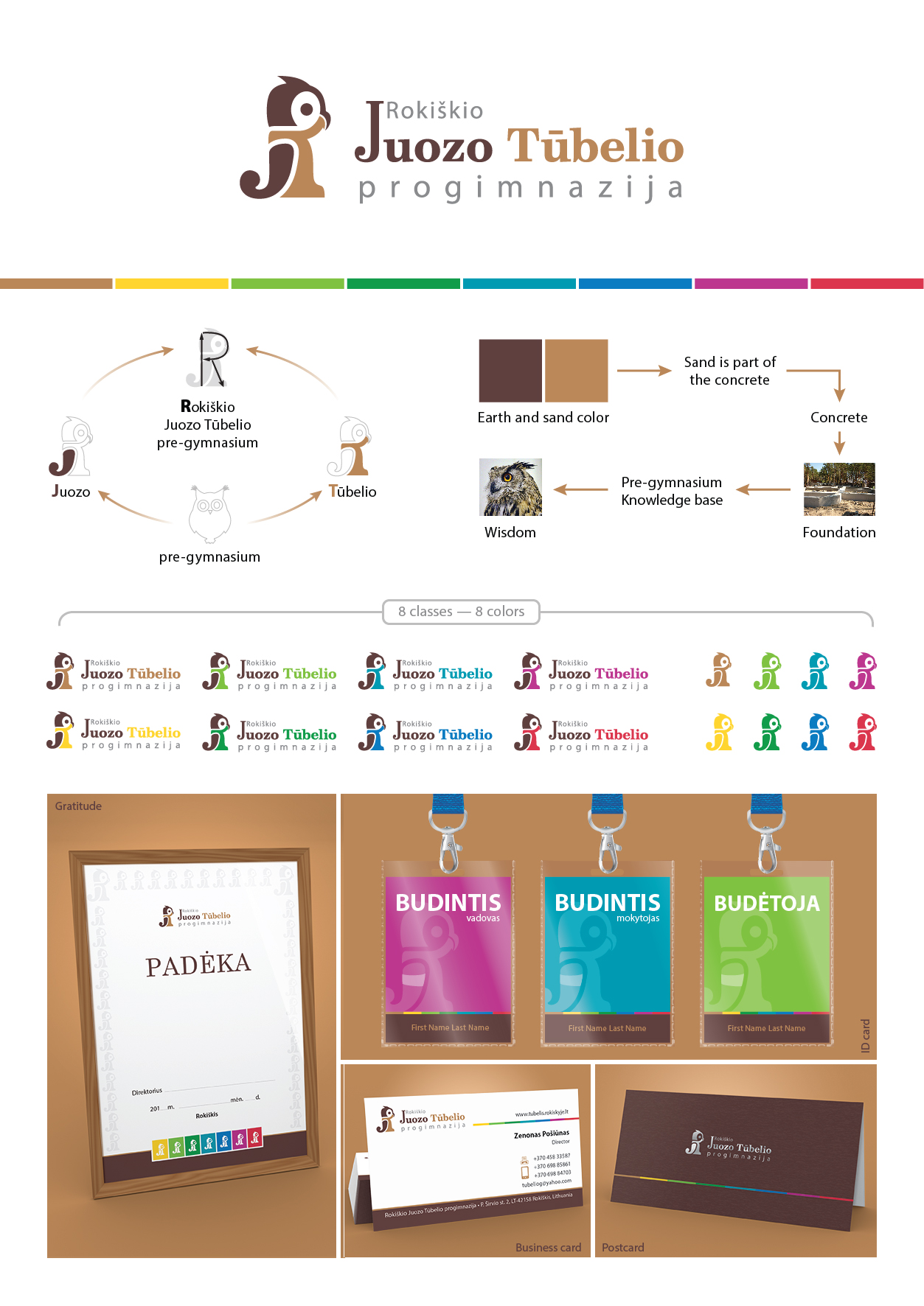
F-01-01. Сова
| Агенство | Aрте Фелиз |
| Творчий керівник | Агата Авсеенко |
| Автор ідеї | Вадим Гевельчук |
| Продукт | Учебное заведение, начальная школа |
| Опис | About: Roki?kio Juozo T?belio pre-gymnasium, which educates scholars from fifth to eight grades. Goal: All schools in Lithuania have one common trait – they pay little attention and allocate little resources to the heraldry of the school. The result is an outdated, often even out of tune and contradictory heraldry of the school that misleads not only school’s partners and sponsors, but the pupils as well. The goal is to create modern and even heraldry that would be remarkable and easily recognizable among Lithuania’s schools, as well as foreign schools. Solution: The symbol of the pre-gymnasium is selected to be an owl – an ancient symbol of academics and wisdom. But it is no ordinary, old bespectacled lady, but stylish and youthful owlet. This owlet appeals to the young age of the pre-gymnasium’s students. Implied meaning – even the wisest people at some point were children, and therefore process of learning is eternal. The main colour of the symbol is sand colour. Soil and sand are the foundation of everything in the planet Earth. The school’s main goal is to give its students the foundation of the knowledge. The symbol is universal – it is possible to use eight combinations of colours, and its meaning is not lessened, as the symbol has many meanings. One of them is the initials of RJT – school’s name – from which owlet’s body is created. It is vital for a symbol to reflect school’s spirit. In this case, the aim is definitely achieved. |
| Склад творчої групи | Агата авсеенко, Арт директор Вадим Гевелчук, Дизайнер |