A. FILM
B. PRESS
C. OUTDOOR
D. RADIO
E. FILM CRAFT
F. DESIGN
G. INTERACTIVE
H. CREATIVE USE OF MEDIA
I. PR-PROJECTS
J. MARKETING SERVICES PROJECTS
K. ADVERTISING CAMPAIGNS
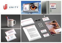
F-01-25. UNITY personnel agency
| Agency | LINII |
| Creative head | Mikhail Gubergrits |
| Author of idea | Mikhail Gubergrits, Vlad Zhukovets |
| Product | personnel agency |
| Description | UNITY employment agency is one of the 5 leading HR agencies in Russia. However its corporate style remained unchanged since 1991 and was no longer consistent to the company’s leading positions. We chose a magnet as a metaphor for the new logo and corporate identity due to several reasons - as a symbol of effective search (as Russian proverb says – ‘finding a needle in a haystack’) or selection of a correct direction (as in a compass). The magnet has a U-shape, reminding of a first letter in «Unity». The corporate colors - bright-red, color of leadership and energy, and dark blue. Combined together, they product as association with a foreign company (possibly, from the United Kingdom or US). A flexible unit of blue and red stripes is a good visual support for the text, while two triangular cutouts create an association with a compass and support the idea of completing any task in the shortest and most efficient way. For the photostyle we used bright and charismatic imagery, attracting attention on possessing their own, unique ‘magnetism’. |
| Team members | Mikhail Gubergrits - creative director, Vlad Zhukovets - designer |


