A. FILM
B. PRESS
C. OUTDOOR
D. RADIO
E. FILM CRAFT
F. DESIGN
G. INTERACTIVE
H. CREATIVE USE OF MEDIA
I. PR-PROJECTS
J. MARKETING SERVICES PROJECTS
K. ADVERTISING CAMPAIGNS
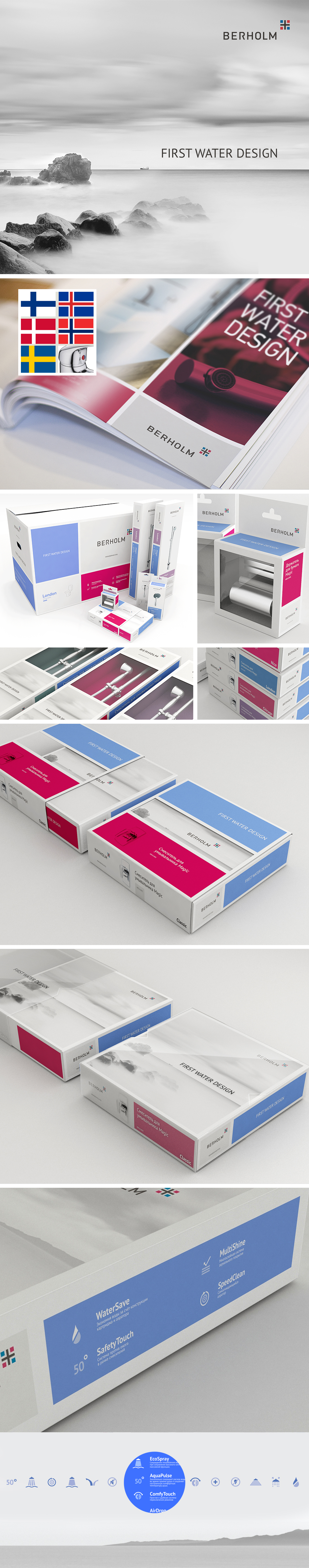
F-08-32. Berholm
| Agency | Brandson branding agency |
| Creative head | Brandson branding agency |
| Author of idea | Brandson branding agency |
| Product | Products for bathroom from Denmark |
| Description | The idea of the logo is to create a transparent semantically mark. Use in a corporate style red-and-blue cross form the necessary context for products Berholm. Thus, the form of the sign is a reference to the idea of Scandinavian design and quality (there is a cross on the flags of all the Scandinavian countries). Also the combination of red and blue is an indicator of hot and cold water that clearly mark the scope of the company. Agency developed a concise and rigorous style that supports the basic idea of the sign and it’s enhanced by images, which show a restrained beauty of northern nature. Brand line - First water design - reflects the leadership status and authenticity, transparency and depth of ideas of Scandinavian designers. Packaging for various types of quality products: mixers, watering cans, bathroom accessories - got a clean design, which incorporated all the basic ideas of corporate identity. A set of high-quality, thoughtful icons, that was traced on the package, make the use of Berholm products more convenient. |
| Team members | Strategy: Elena Ufereva, Elena Arkadeva; Project Director: Elena Arkadeva; Art Director: Timur Salihov;, Design: Roman Mavrin, Vladimir Ilyashenko; Copywriting: Aleksey Rumyancev; Assistant: Marina Alieva |